 Index
Index 
20131125 20160412 Death
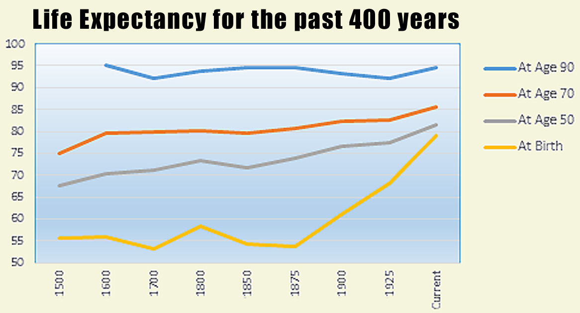
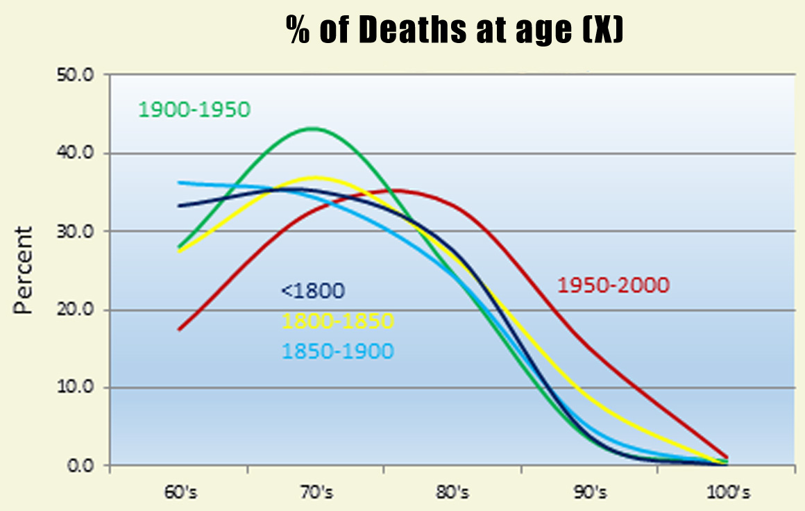
Both graphs are based on 11,000 ages at death from the Sinnocks and Kin database. The graphs put to bed the myth that modern medicine has signicantly increased life span of older folks, maybe a little for 50 and 70 year olds but almost nothing for 90 year olds. Modern medicine is represented on the left graph by increased slopes of the lines since 1925. The right graph does show a slight increase in percent of deaths vrs. age (red line, 1950-2000 compared to yellow line, 1800-1850), but the average percent is dominated by keeping more young people alive rather than keeping old people alive much longer (both graphs). |